Sketches, musings, and other stuff from my perspective. I’d love to hear from you (because I don’t know if anyone ever sees this) so please let me know if you’re out there.
Our wet Winter brought brilliant wildflowers to California in the Spring and I was delighted. While on my walks, I photographed the variety of colorful blooms and then went to the studio to paint.
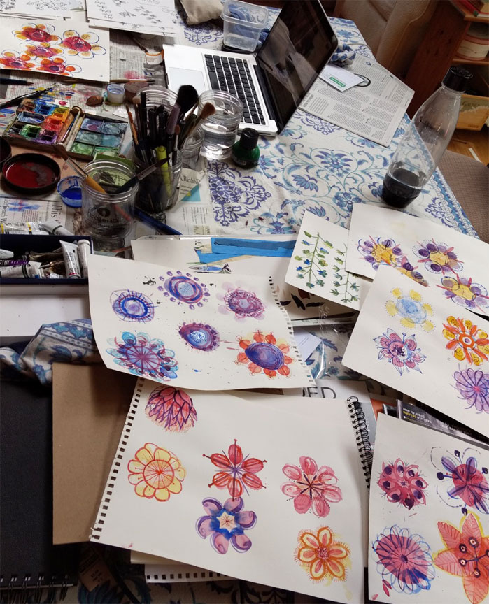
Flower painting in my studioSizes ratios are not consistent hereSometimes it’s hard to identify the species, even with the Seek app.
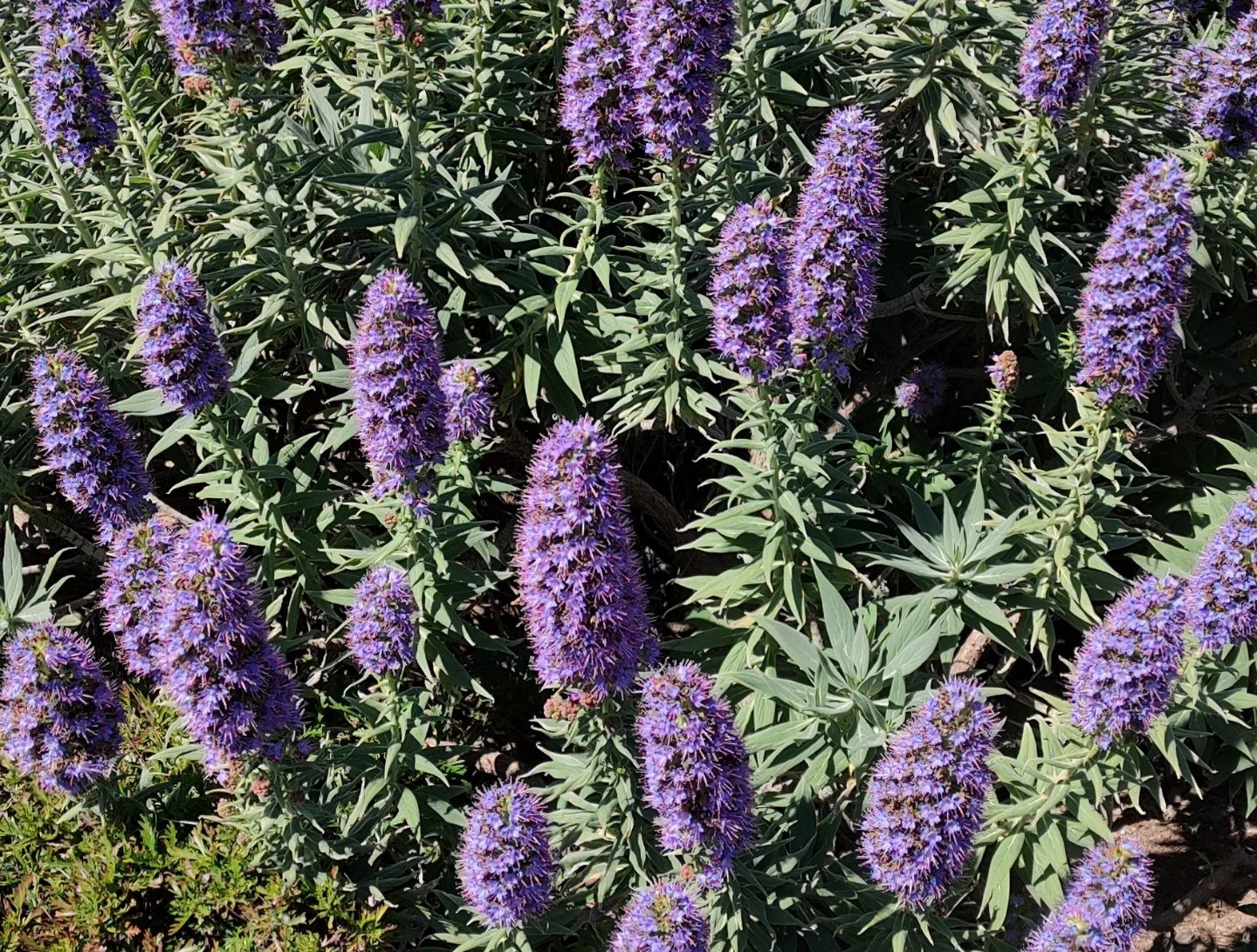
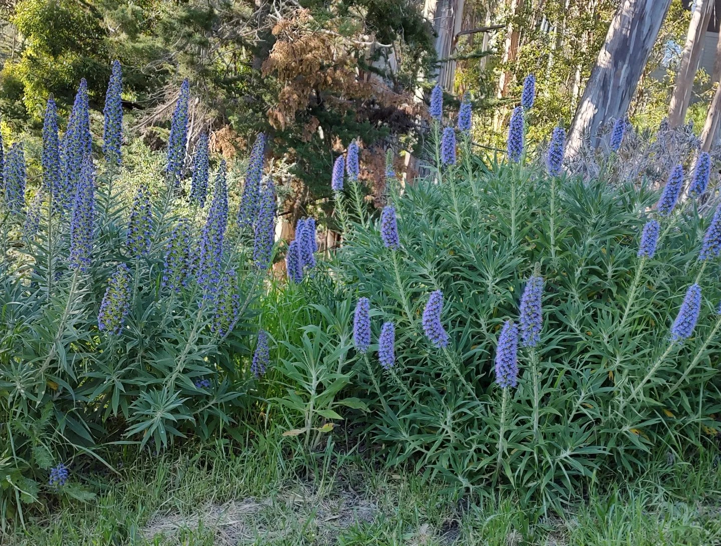
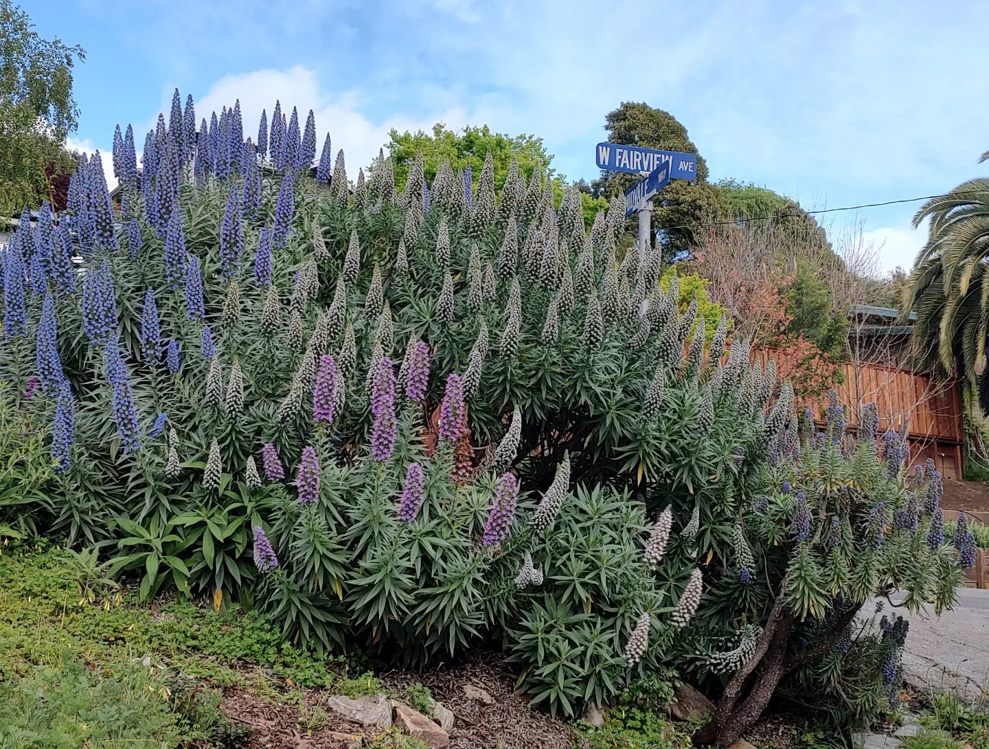
Spotlight on Pride of Madiera
Pride of Madiera is an invasive species that thrives in NorCal coastal areas. The blossoms on this bush start as cone-headed shoots, which grow into a plethora of tiny purplish blue flowers, some with fuchsia hairs . The bushes can grow to be 20 feet tall.
This year, I pulled off one of the little buds to find that it was its own gem: an incredible curl of plant with tiny periwinkle colored flowers along with that fuchsia hair and buds. I was mesmerized and drew numerous studies of the flowers.
Pride of Madiera from a variety of distances and angles
Here are some photos of Pride of Madiera in action
Incredible, right?Some of the blossoms are pink, some are more on the white sideHillside surrounding the Robin Williams tunnel entry going into Marin County from the Golden Gate Bridge
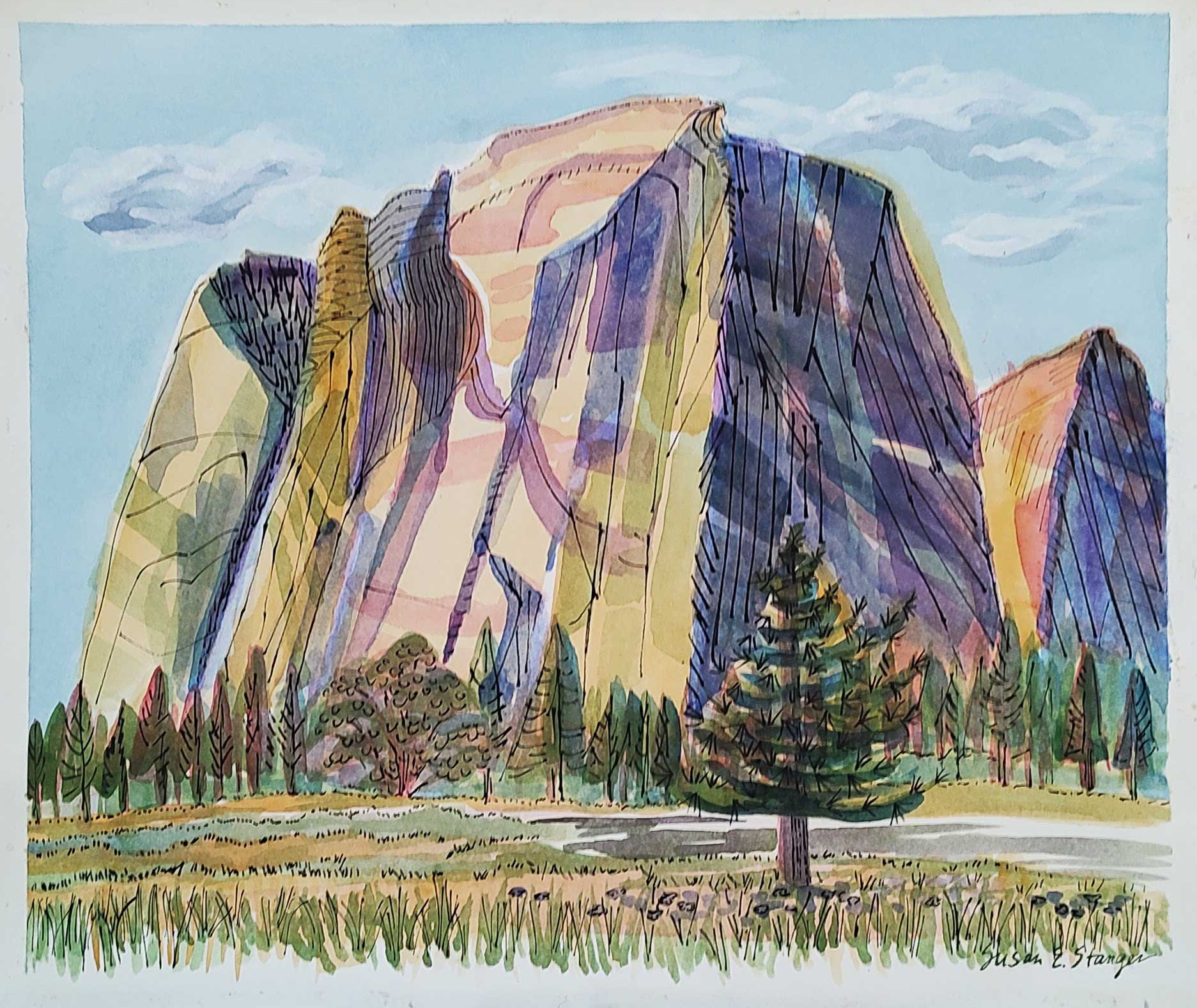
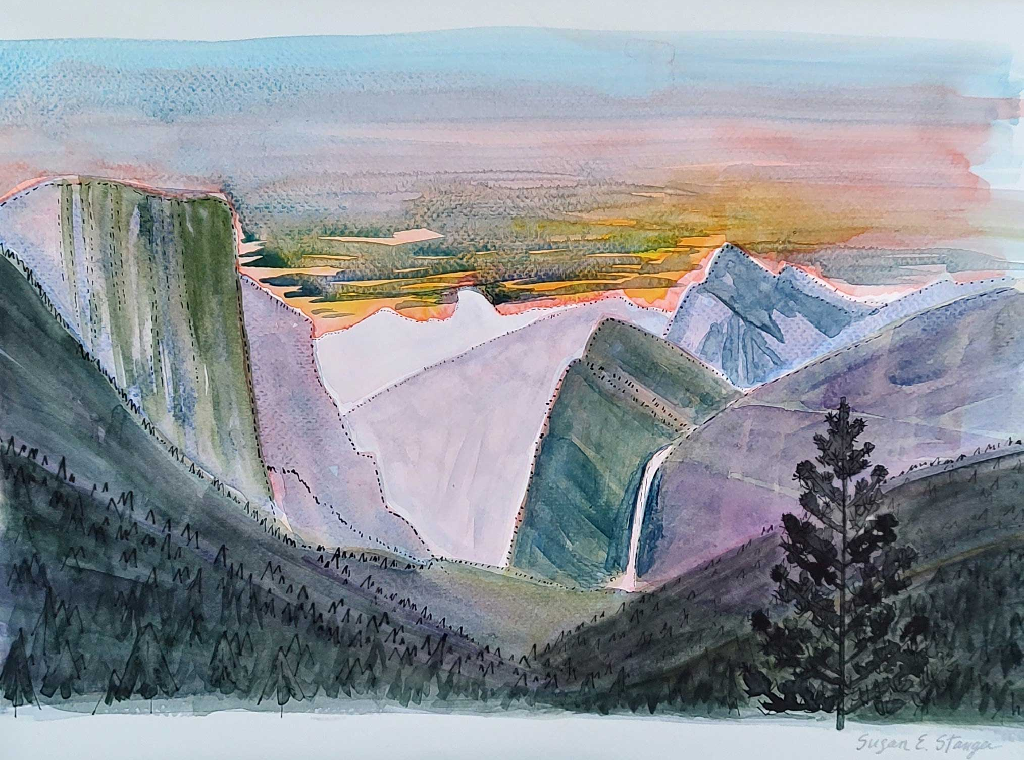
Last June, I learned a new style of capturing landscapes in Yosemite Valley (what better place?). My teacher was the fabulous Oregon painter, Lindsey Fox who was teaching the week-long retreat.
Cathedral Rock, across from El Capitan
Every day was jam packed with lessons as we trekked to different locations in the Valley. While I was learning new techniques, my family was gallivanting in the same natural playground. I’d scored a camping permit so we could all enjoy the majesty that is Yosemite.
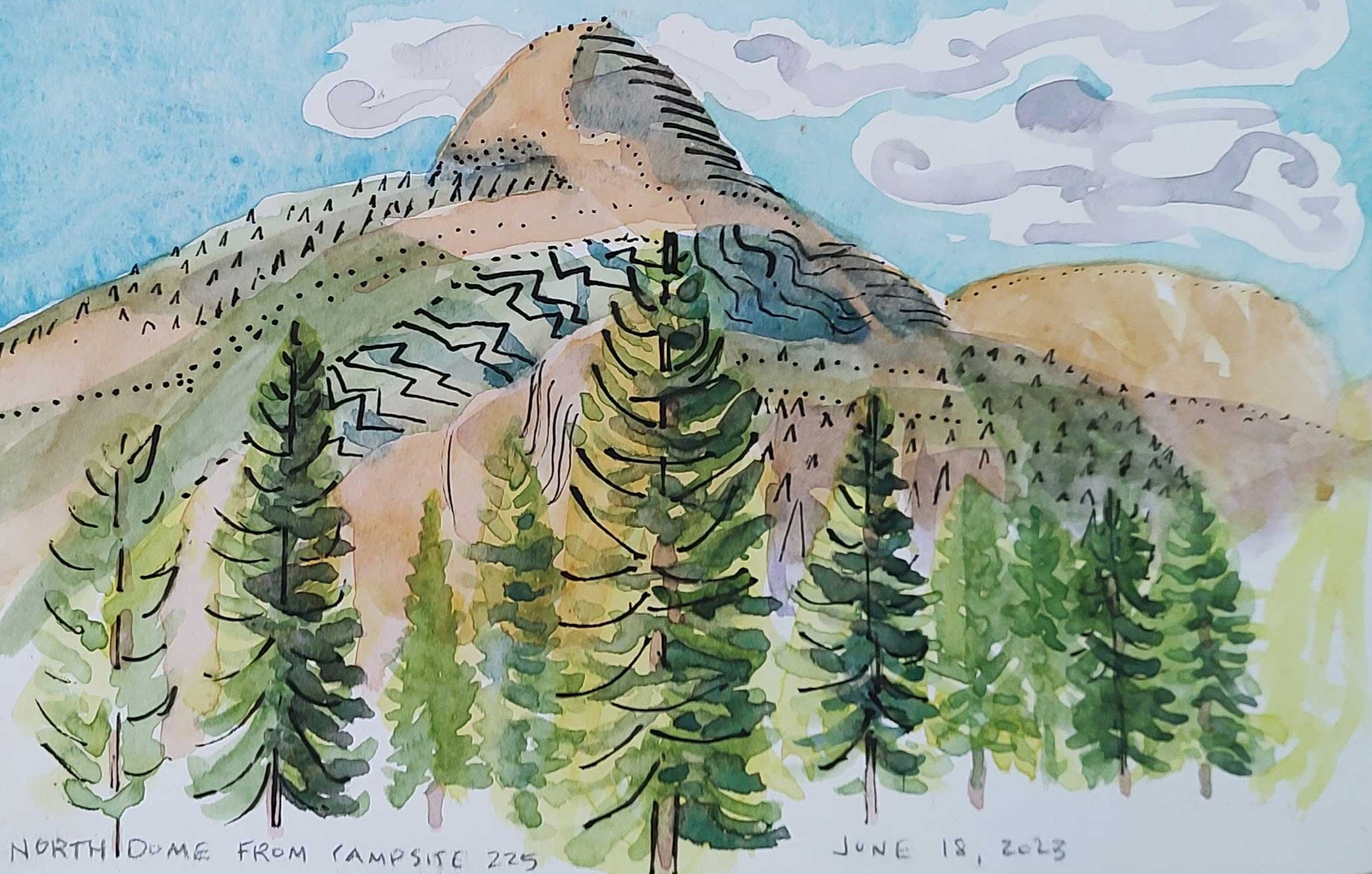
Dreamers campsiteNorth Dome from our campsite
After the record breaking rains of 2022-2023 Winter, the Merced was raging. We could hear the river’s roar by day and feel the vibration when we lay in our sleeping bags at night.
Sunrise from Tunnel ViewSunrise at Tunnel View II
We woke up at 4 am to make it to Tunnel View for sunrise. It was COLD but worth it.
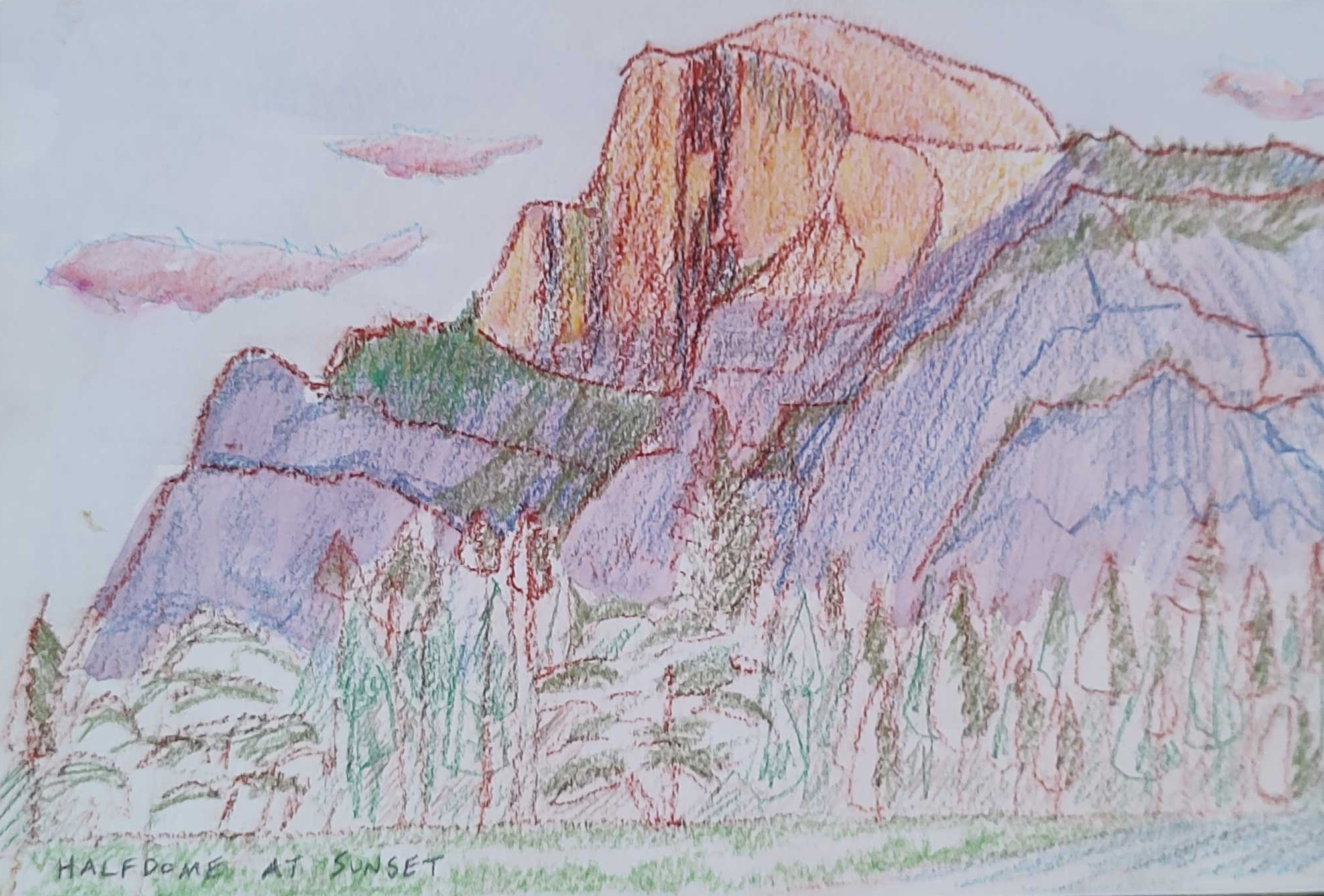
Tunnel View studiesHalf Dome at sunset. Colored Pencil drawing
Needless to say, I get jazzed just thinking about Yosemite and I am at my happiest making art there.
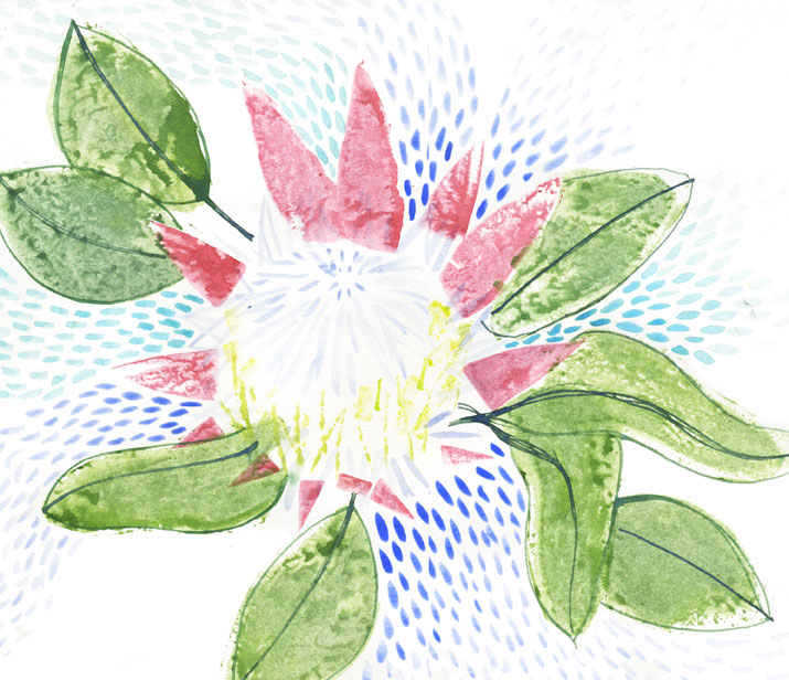
I’ve been captivated by a neighbor’s garden where king protea are blooming. Whenever I pass by, I am drawn to the flowers like a bee to honey and I just gape at them. This has brought me to paint them, of course. Here’s the series I completed.
Most of these were created with potato and carrots to stamp shapes in watercolor, with brush embellishments. I got really into the stamping technique.
I was trying to get to the basic elements of the flower here. Thin line details were completed with watercolors in a dip pen.
This was the first one I did. Pent up desire to draw/paint these flowers just came out in one go.
When I can’t go out, I go in. And usually, that means making art.
I discovered the fabulous Esté MacLeod on Instagram and she quickly became my favorite artist on the platform. She starts with letters or numbers and turns them into beautiful paintings. When I saw that she was offering a free course on playing with shape and color, I was all over it.
The first part was to draw numbers 1 – 9 and turn those digits into leaves, real or imagined.
When I tried to think of ways to do this, I got stuck. But when I just let my pen move and got my head out of it, I ended up with some interesting patterns and shapes.
This slideshow requires JavaScript.
The next step was to put them into more plant-like formations and paint them with watercolor. She encouraged the class to use a dip pen with the watercolor applied by using a brush as well as brush painting. I’d never used this method before and was delighted by the effect.
This slideshow requires JavaScript.
The next step was to employ potato, carrot, toilet paper roll and other items found in the house, to create flower shapes and then embellish them. Once again, I had trouble because at first they all turned out looking the same and I kept thinking about how I could do it. But when I tried not to think and just moved my hand to draw and paint lines, curves and shapes, the results surprised and delighted me.
This slideshow requires JavaScript.
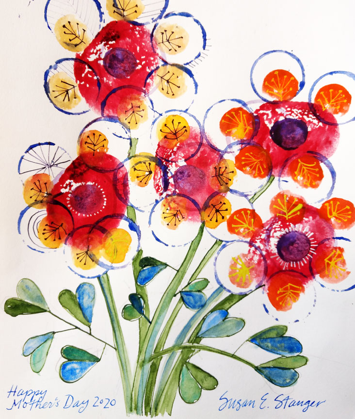
I made this one for my mom since she LOVES flowers and today is Mother’s Day.
These were all my favorites. I will use them elsewhere, I’m sure.
As an illustrator, I know that I should choose one style and be consistent with it so people can easily associate my work with me. But not all styles fit all functions.
I was recently asked to design a set of posters for San Francisco Strong (#sfstrong-posters) to illustrate the ways we can protect and support ourselves and others during our current pandemic. The small posters would go in people’s windows so I needed to have the work be bold, graphic and easily read from the street.
My sketch style has evolved over the years to what you see on the rest of my site, but back in my Kaua’i days, my work looked very different.
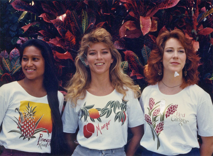
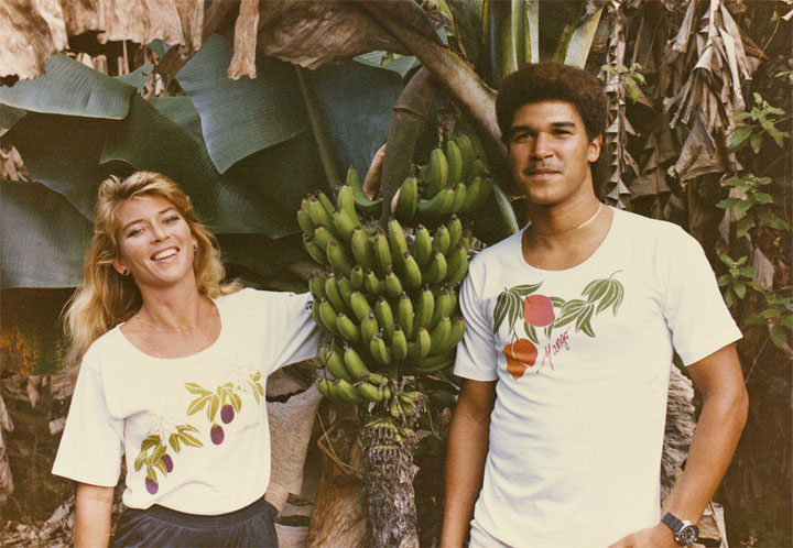
Three beauties modeling my work
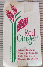
In my first major entrepreneurial venture, Red Ginger, I designed and sold T-shirts, which I printed in my garage. At the time, my technique was to cut the drawing and lettering through a thin layer of laquer film that was stuck to acetate. After peeling off the positive areas, I adhered the laquer (with a nasty chemical) to the screen, removed the acetate and then squeegeed the ink through to the fabric. I had to use an x-acto knife as my primary tool (not quite as bad as using your finger as a stylus, but you get the idea).
Additionally, I employed a homemade system of two screens on hinges so I could make two color designs. It was a crude system that could not handle tight registration.
The screens in my studio
That’s me at the drawing board
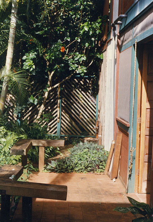
Everything dried out here on the patio
Due to these technical limitations, my style developed to include white lines between large color blocks.
Another promo shot
At Anahola Beach. That’s me, with the hair, on the left
Full disclosure: not printed by me
Looking at these, I think they’re pretty simplistic but I still love them
Fast forward to today (you knew I’d get here at some point). I instinctively conceived of the #SFStrong.posters in this graphic style.
So that’s why they’re so different from my sketches. But actually, I think that most, if not all illustrators have many styles but they choose to put only one forward for the reason I mention above.
Do they wish they could mix it up more? Do they do that? I’d love to hear your thoughts on this.
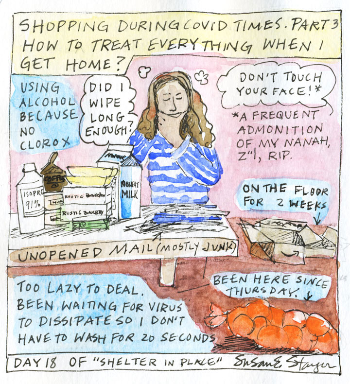
The day after we returned from the Big Island, we were directed to start sheltering in place. We’d already planned to do this (after all, we’d been traveling), so it wasn’t a surprise.
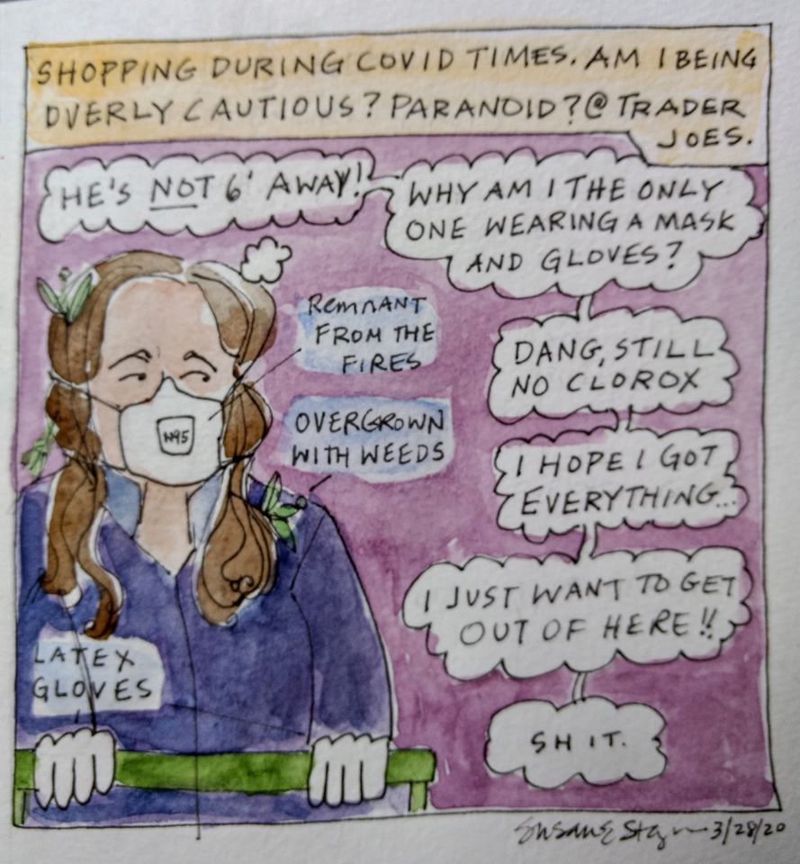
It’s just that shopping was (and still is, at time of this post) a scary experience. My therapy is to make comics.
I’m not wearing gloves to the store anymore but I was when I did this comic, and it was a major juggle.
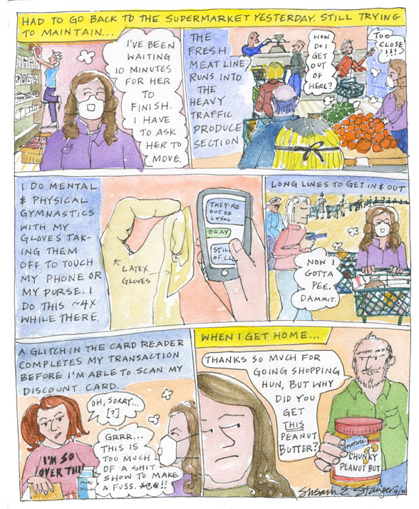
Just wanting to get out asap makes for lousy choices and lower quality produce (grab that bag of mangoes and find out that the ones at the bottom are all wrinkled and kinda brown).
I had seen a video of this doctor who disinfected everything and then I read that I didn’t have to. SO CONFUSING.
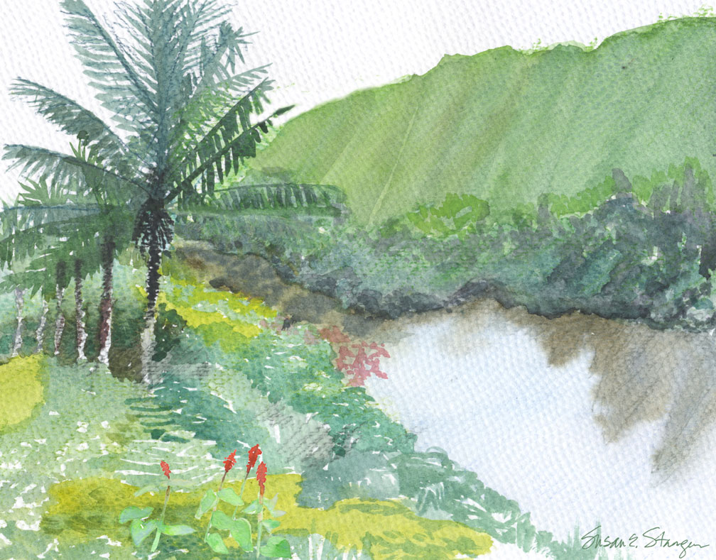
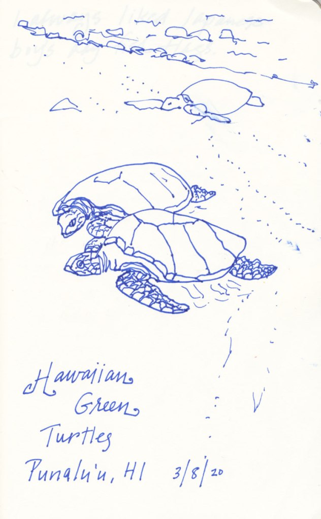
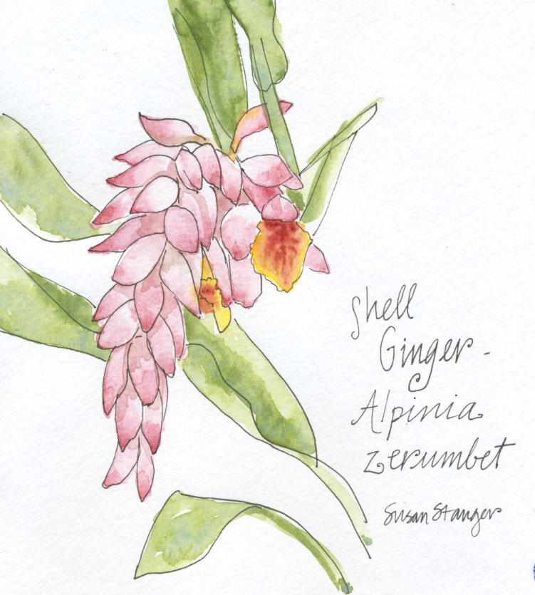
The incredibly beautiful, serene Waipio ValleyWaipio Valley coastline. Looks like good surf. Heck, yeah!Plenty of these big ass tree ferns in VolcanoChillin’ in Kea’au. It was dark and I could barely see the paper while drawing/painting.All these guys sunning on the South Side.Love this flowerPau hana at the Seafood Tiki Bar. These guys just off from work. Celebrating aloha Friday. Had no supplies on me. Used the back of my Long’s receipt and the busboy’s pen.


 In my first major entrepreneurial venture, Red Ginger, I designed and sold T-shirts, which I printed in my garage. At the time, my technique was to cut the drawing and lettering through a thin layer of laquer film that was stuck to acetate. After peeling off the positive areas, I adhered the laquer (with a nasty chemical) to the screen, removed the acetate and then squeegeed the ink through to the fabric. I had to use an x-acto knife as my primary tool (not quite as bad as using your finger as a stylus, but you get the idea).
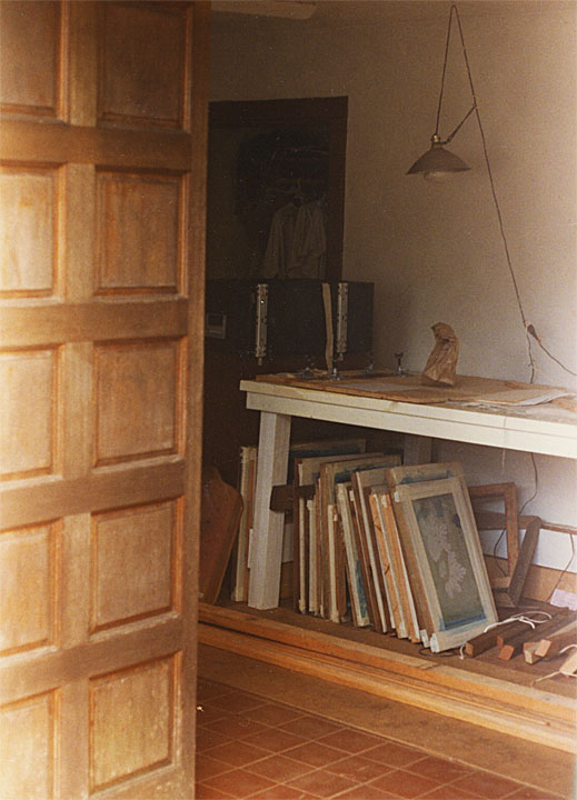


 Stay safe everyone!