Form follows function
As an illustrator, I know that I should choose one style and be consistent with it so people can easily associate my work with me. But not all styles fit all functions.
I was recently asked to design a set of posters for San Francisco Strong (#sfstrong-posters) to illustrate the ways we can protect and support ourselves and others during our current pandemic. The small posters would go in people’s windows so I needed to have the work be bold, graphic and easily read from the street.
My sketch style has evolved over the years to what you see on the rest of my site, but back in my Kaua’i days, my work looked very different.
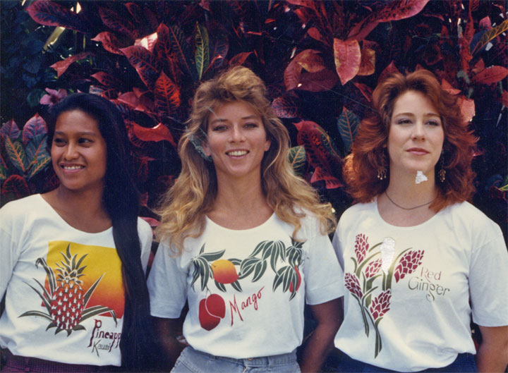
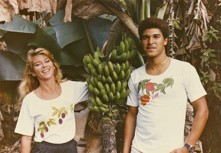
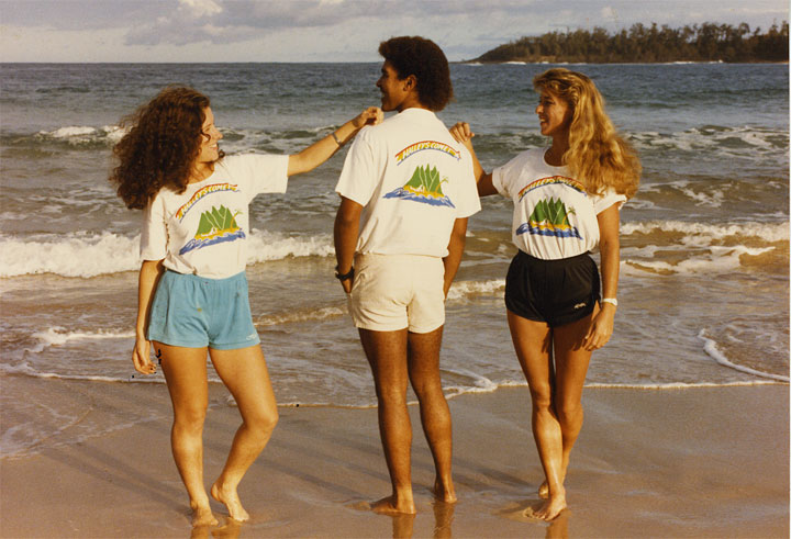
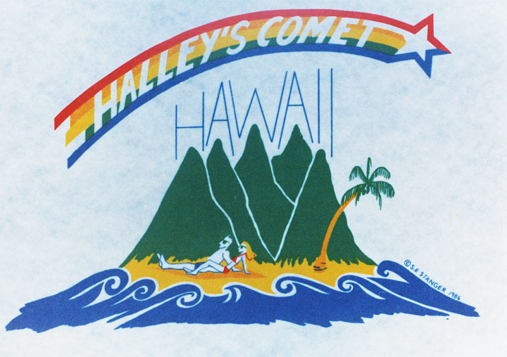
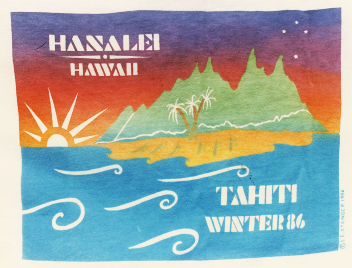
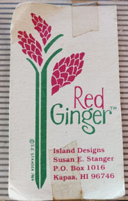 In my first major entrepreneurial venture, Red Ginger, I designed and sold T-shirts, which I printed in my garage. At the time, my technique was to cut the drawing and lettering through a thin layer of laquer film that was stuck to acetate. After peeling off the positive areas, I adhered the laquer (with a nasty chemical) to the screen, removed the acetate and then squeegeed the ink through to the fabric. I had to use an x-acto knife as my primary tool (not quite as bad as using your finger as a stylus, but you get the idea).
Additionally, I employed a homemade system of two screens on hinges so I could make two color designs. It was a crude system that could not handle tight registration.

Due to these technical limitations, my style developed to include white lines between large color blocks.
Fast forward to today (you knew I’d get here at some point). I instinctively conceived of the #SFStrong.posters in this graphic style.
So that’s why they’re so different from my sketches. But actually, I think that most, if not all illustrators have many styles but they choose to put only one forward for the reason I mention above.
Do they wish they could mix it up more? Do they do that? I’d love to hear your thoughts on this.
Stay safe, everyone.
Susan
