Sketches, musings, and other stuff from my perspective. I’d love to hear from you (because I don’t know if anyone ever sees this) so please let me know if you’re out there.
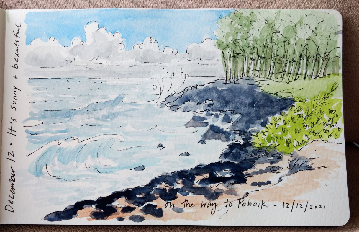
I don’t really know the Big Island. My experience is with Kaua’i and Oahu but here we are on this beautiful rock and it is enchanting. There are areas that bring me back to the feelings of exploration and wonder that I had when I first arrived in Hawaii back in 1982.
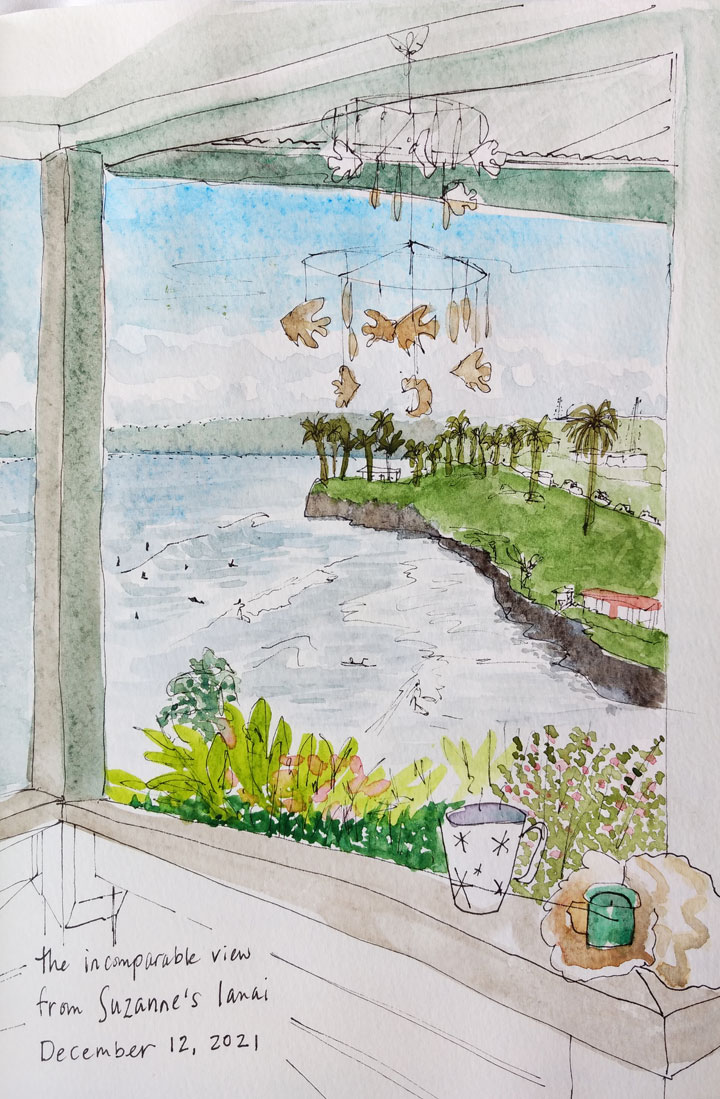
We’re staying with our dear friend Suzanne in Hilo and can’t believe our luck—her home sits on a bluff overlooking a kick ass surf spot that has me constantly itching to get out and hit the waves. I feel so blessed to be here!
I just finished listening to the book Moloka’i by Alan Brennert. The story follows the life of a Hawaiian woman who contracts leprosy at age 6. It illustrates the upheaval to her life and her family along with radical changes occurring in Hawaii from the late nineteenth to mid-twentieth centuries.
I know much of the islands’ history and was pleased to hear it described from a sympathetic perspective, particularly:
The way that missionaries and foreigners treated the Hawaiian people with condescension, while attempting to annihilate their culture and language
How leprosy (among other diseases) decimated the native community and tore apart families
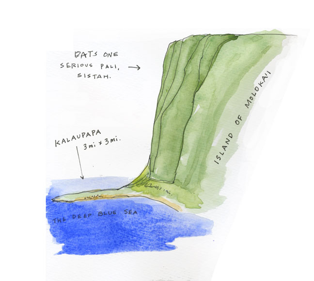
The banishment of leprosy victims to the remote peninsula of Kalaupapa on Moloka’i
The death of King Kalakaua
The illegal overthrow of the Hawaiian monarchy by a bunch of American businessmen (after the January 6 insurrection, this became very real to me) and Queen Liliuokalani’s subsequent imprisonment
The bombing of Pearl Harbor
The Mainland imprisonment of Japanese Americans
The emergence of many technologies like air travel and motion pictures
in 1993, there was a major commemoration for the 100th anniversary of the overthrow, including a reenactment using the exact words of the conspirators. The director of that performance was concerned that people would become angry and violent with the actors, so she engaged peacekeepers to help calm the crowd and I was one of these. We had to move the play from one part of the grounds to another but forgot to leave a sign regarding that fact. About 15 minutes before it started, I had the dubious honor of redirecting the crowd, which had gathered in the wrong location.
Other memorable details include fictional interactions with Father Damien. Damien is historically written as a hero: someone who came to lawless Kalaupapa and imposed order and civilization. In the book, he’s a religious zealot (one of those “my way (salvation) or the highway (Hell)” guys) and I realize that he was; he may have brought some needed management but I can no longer think of him as a factor only for good.
The victims were all treated like criminals—shunned by their families and society, banished and basically imprisoned. Many died so fast that their graves remain unmarked. The Christians on the peninsula were heavy-handed in the way they treated the patients, e.g. in the book, they don’t allow the girl to live with her only family in the settlement, her Uncle and his lover (also patients), because they “feared for her safety” being out in the community. Instead she’s forced to live with the nuns and is raised by them.
World’s most beautiful prison
But I digress. Listening to the book brought back flashes of my own visit in 1990. I had joined a weekend Sierra Club service trip to help clear some of the many unmarked graves. We flew from Honolulu to Kaunakakai and then in a puddle jumper to that apron of land bordered by dramatic, vertical pali (ridges) and the Pacific ocean itself. Were it not for its terrible past, the place might be considered a remote paradise. Kalaupapa is now a national historical site.
It was like the town that time forgot, with cars from the 40’s and 50’s, dirt roads, limited electricity and only a few residents. When the cure for Hansen’s disease was finally discovered, some patients at the settlement decided to stay in the community rather than live out in the world with their disfigurement and the stigma attached to it. We stayed in the Parks Service bunk house and ate our meals as picnics or in the main house. It was strikingly beautiful and HOT as there are many harsh, open areas. The work was hard but satisfying and during our break, we explored the coast.
By Sunday afternoon, the fog had rolled in and stubbornly refused to leave, meaning that our flight out was canceled and we were staying another night. I was secretly thrilled, but my manager at Hawaiian Graphics was less so—when I called to say I wasn’t able to report to work the following day, she was pretty cranky about it (I think she was jealous).
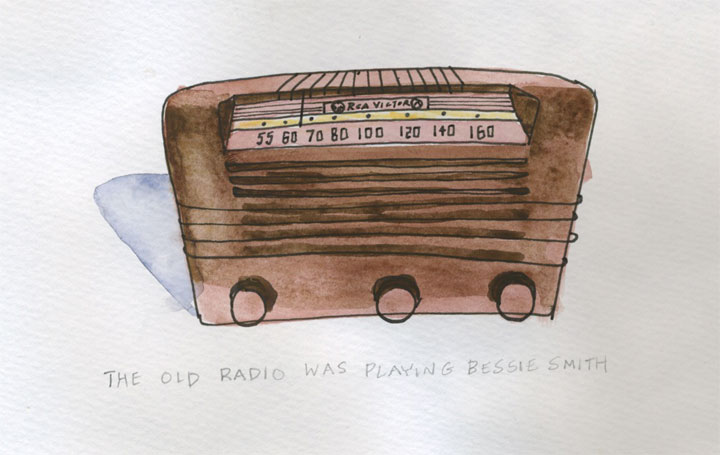
That chilly evening, Kalaupapa was enveloped in mist and a spirit of bygone days. As we dined in the main house among the aged furnishings and décor, a show playing old jazz from Honolulu sputtered through the radio, the sound waves remarkably crossing the 26-mile Ka’iwi channel between the islands, adding to the mystery of the night. This is what I remember most about that trip to Kalaupapa—the feeling of a time warp in a place that time forgot.
My family has a hereditary passion for desserts. When I was growing up, this was particularly evident with the plethora of candy, cookies and cake that was always in the house. East coasters might remember the melt-in-your-mouth dream of the partially hydrogenated vegetable oil + sugar filled Yankee Doodle (Drake’s cake) or the pungent artificial flavoring of a Butterscotch Krimpet (Tastykake). Well, those were staples in our fridge, along with any number of Entenmann’s pastries.
Summer after my first year in college usually found me hanging out with my high school buddy, Liz. Life was good! Especially when we stumbled into the kitchen on a humid Jersey eve after my folks had hosted a party. There was an extra cornucopia of sweets and in somewhat of an altered state, we eagerly dove into the riches but with a discriminating perspective: we rated each of the delights on a Shop Rite memo pad.
In the morning, when my folks discovered the list, they couldn’t stop laughing and posted it to their bulletin board, where it lived for decades. They still tell the story and we all get a good chuckle about it.
When I found a copy of the treasured list in a pile of old memorabilia yesterday, I was compelled to preserve it once again, but with a little more embellishment. So now it lives on Suzine!
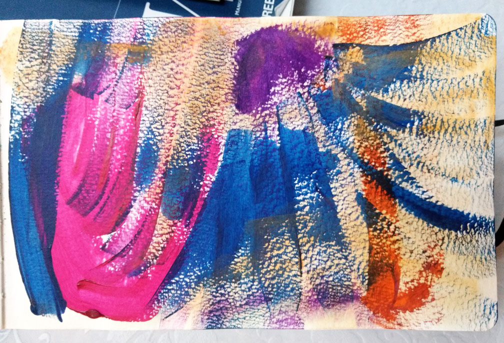
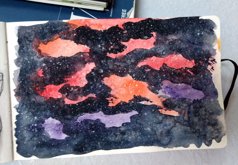
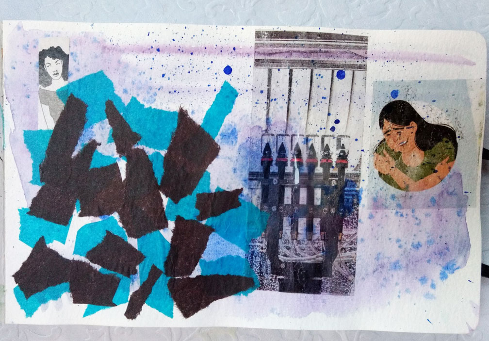
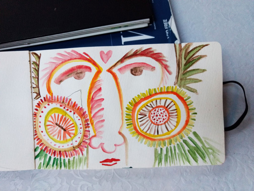
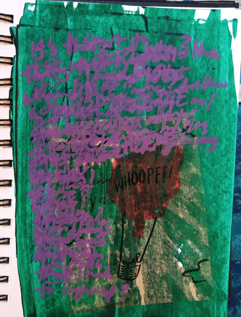
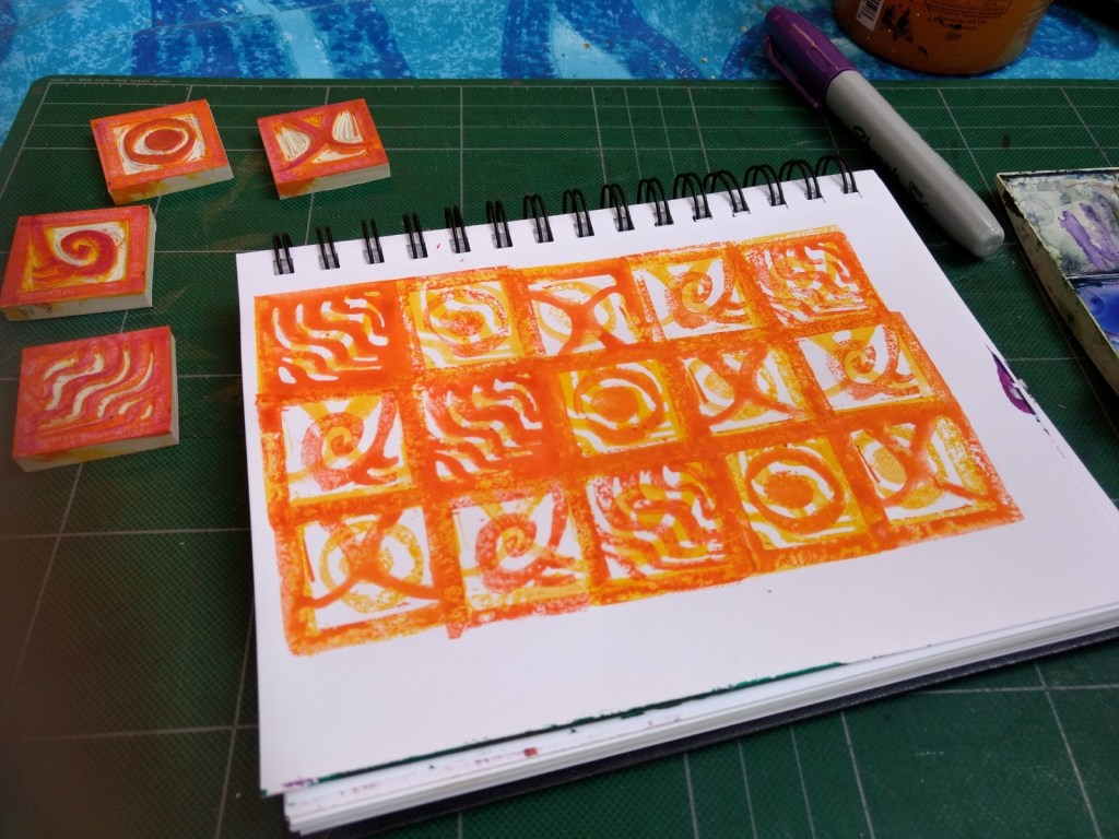
It’s been a cornucopia of art journaling workshops lately. The wonderful Estè MacLeod supplied the info about an incredible opportunity—something called Sketchbook Revival, which offers free art journaling classes by one or two different teachers each day. It’s so rich with fabulous techniques for thinking, not thinking, mark making, collage, rubber stamping, book creation and just playing. Here are a few that I did with that group. #sketchrevival #artjournaling
At the same time, I attended a class at Congregation Beth Sholom in SF—Art Journaling for the Jewish Soul with Debbie Bamberger. I learned so much and enjoyed playing. It’s hard for me to use these new techniques, I had to loosen up and push things. I just let things happen and many of the pieces didn’t work but that was the point for me. To just keep going. It’s exciting! #bethsholomsf
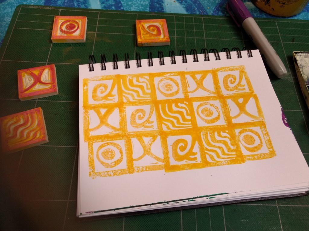
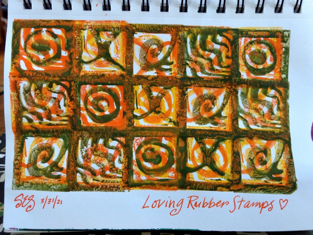
Adding to this post: I finally dug into the rubber stamping project. I’ve been chomping at the bit to get to this but hadn’t had time. SO MUCH FUN! I loved the materials as well as the art itself. I used watercolor because I haven’t been able to get the ink pads yet but that’ll come. I’m sure this won’t be my last project with these. Thank you, Sarah Matthews!
Here’s another piece I did from Sketchbook Revival. Night and Day with Helen Hallows. This was a fun exercise with painting, drawing, collage and even a little rubber stamping. Branching out!
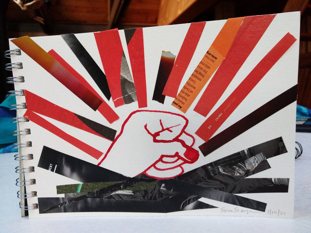
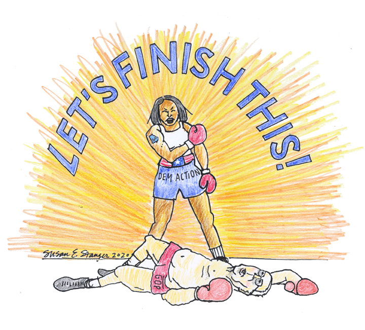
I’ve been consistently active since January 2016. We’re all tired from all the hard work of GOTV but there’s more work to do in Georgia to take a Senate majority. I decided to do a piece to motivate myself and my fellow citizens.
With apologies to Neil Leifer and in homage to Muhammad Ali.
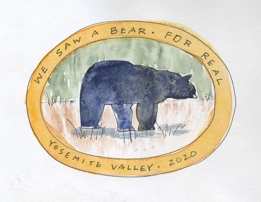
We’re here for our 18th Anniversary. Got here Thursday at dinner time. It’s beautiful and it’s different. We usually come to camp in late May or mid-September. Since it’s late in the season, we’re staying at the Lodge, right across from Yosemite Falls, which is completely dry. It’s only a teeny bit smoky. Many of the concessions are closed and those that are open require masks and are only doing takeout meals, to be eaten inside or out.
The mornings are really chilly (40’s). Friday, we ride our bikes to Mirror lake in the hand-freezing morning. I’m wearing gloves but Mitch has to suffer through it, so we switch to ride on the sunny side of the valley, which makes a big difference. Mirror Lake is a bed of dry sand. Many years ago, they used that to sand the roads in the Winter.
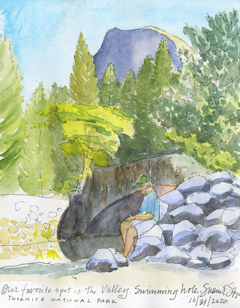
After Mirror Lake, we ride to our favorite spot, the stone bridge with the deep swimming hole. Mitch goes in for a dip, polar bear that he is.
It’s Halloween and we see several people wearing costumes. I wonder if there was a party somewhere but am told that people just want to dress up for the holiday—there isn’t anything “going on.”
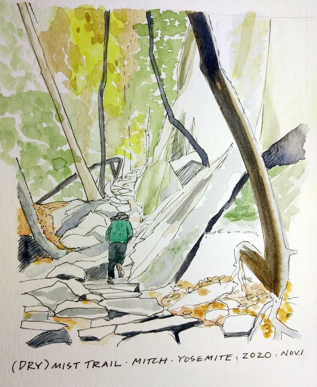
Sunday, we leave the lodge at 9:30 and park at Curry Village to hike up Vernal Falls. I forgot that it’s the same loop we did eight years ago. I think it’s the most popular trail in Yosemite and is usually wet from the intense waterfall. This time of year, it’s not wet nor crowded.
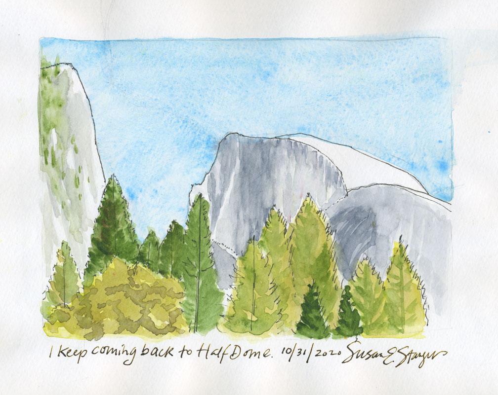
It’s still a groaner getting up that steep flight of stairs. For the hike down, we opt to take the John Muir Trail, which is sublime in its own way. Some time, I’d like to go all the way to the top of Nevada Falls and check out Little Yosemite Valley which leads to the backside of Half Dome, where the final climb up that incredible rock begins. We meet some backpackers who came down from there. It sounds lovely and there’s a campsite. I am probably kidding myself that I’ll go but it’s nice to dream. 🙂
And being here in Yosemite has been overshadowed by the anxiety of the election. I put my phone on DND because I’ve been receiving a multitude of texts, emails and calls exhorting me to make calls and give more money. It’s a messed up time out there in the World. We are all nervous about the election and Covid seems to be here for the foreseeable future.
So we try to stay present and be with the serenity of the park. It is enough.
Through the fires of this year, we’ve occasionally considered moving from the Golden State. However, our trip to the coast reminded me how incredibly beautiful it is here in California.
Fish Rock Watch Tower at the Mendocino Stone Zone, Gualala, CA.
The weather was glorious and clear. We saw whale spouts out in the water, shooting stars in the clear night sky and ate fabulous food.
Pencil drawing of the Fish Rock Watch Tower
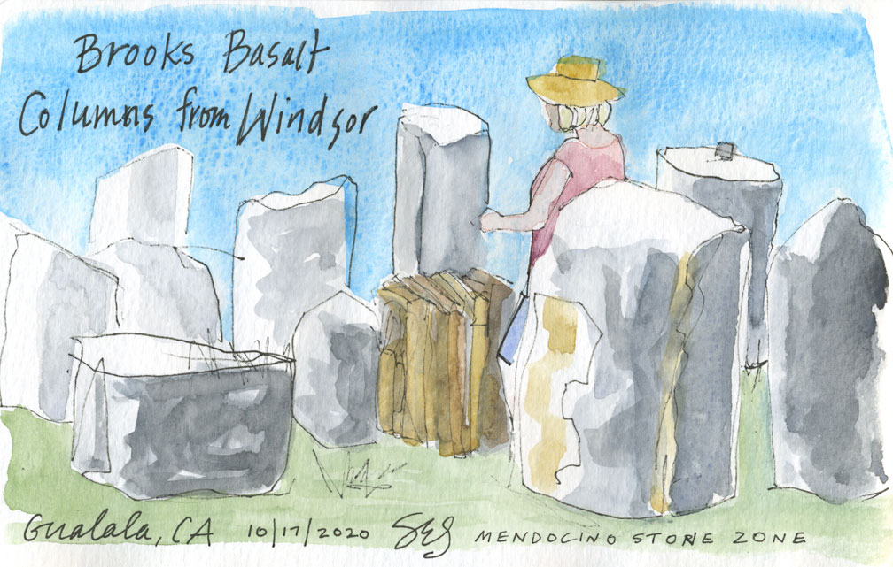
We were treated to a tour of the Mendocino Stone Zone, a place where host Peter Mullins brings in stonemasons from Scotland, Ireland, France and New England to create art within his property in the hills. Peter is a font of knowledge about stone and informed us of a seam of basalt in Windsor, not far from where we live.
Who knew that there were basalt columns in Windsor?
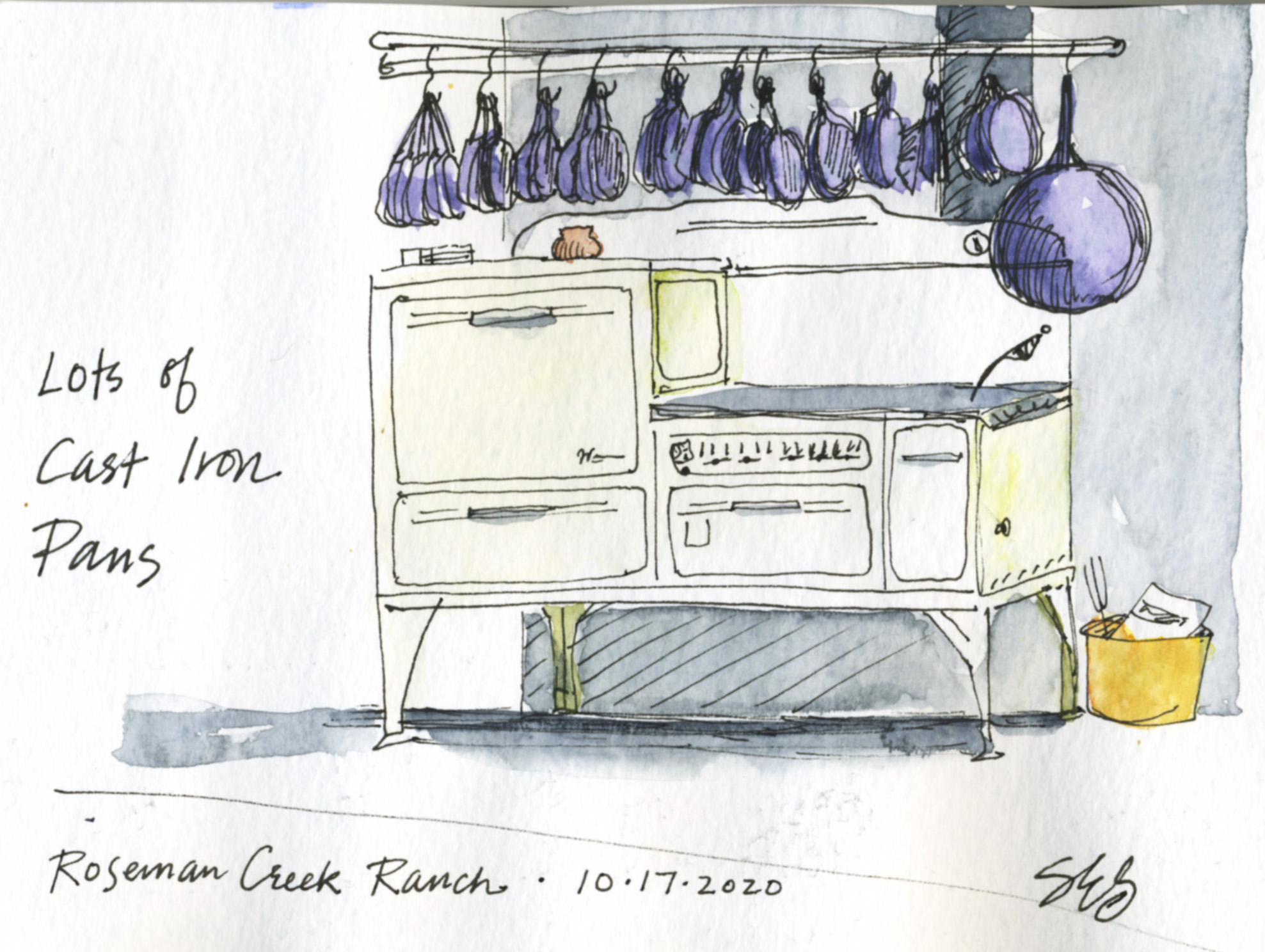
We stayed at Roseman Creek Ranch, which provided a fantastic, huge kitchen. We paid a little extra for the big wood oven to be fired up so we could make pizza and other yummies. What a treat it all was!
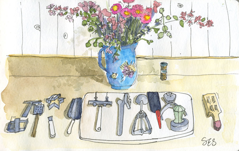
We stayed at the beautiful Roseman Creek Ranch.Lee and Judy made a delicious dinner in the wood fired ovenSo many implements in the kitchen. Fresh flowers from the greenhouse as well.
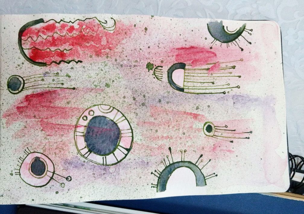
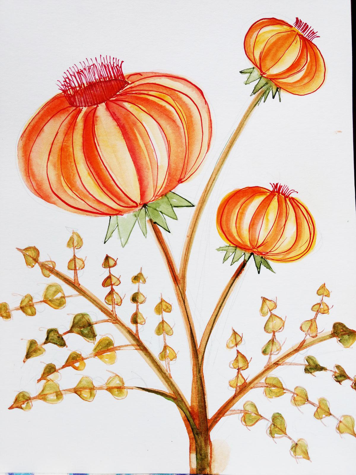
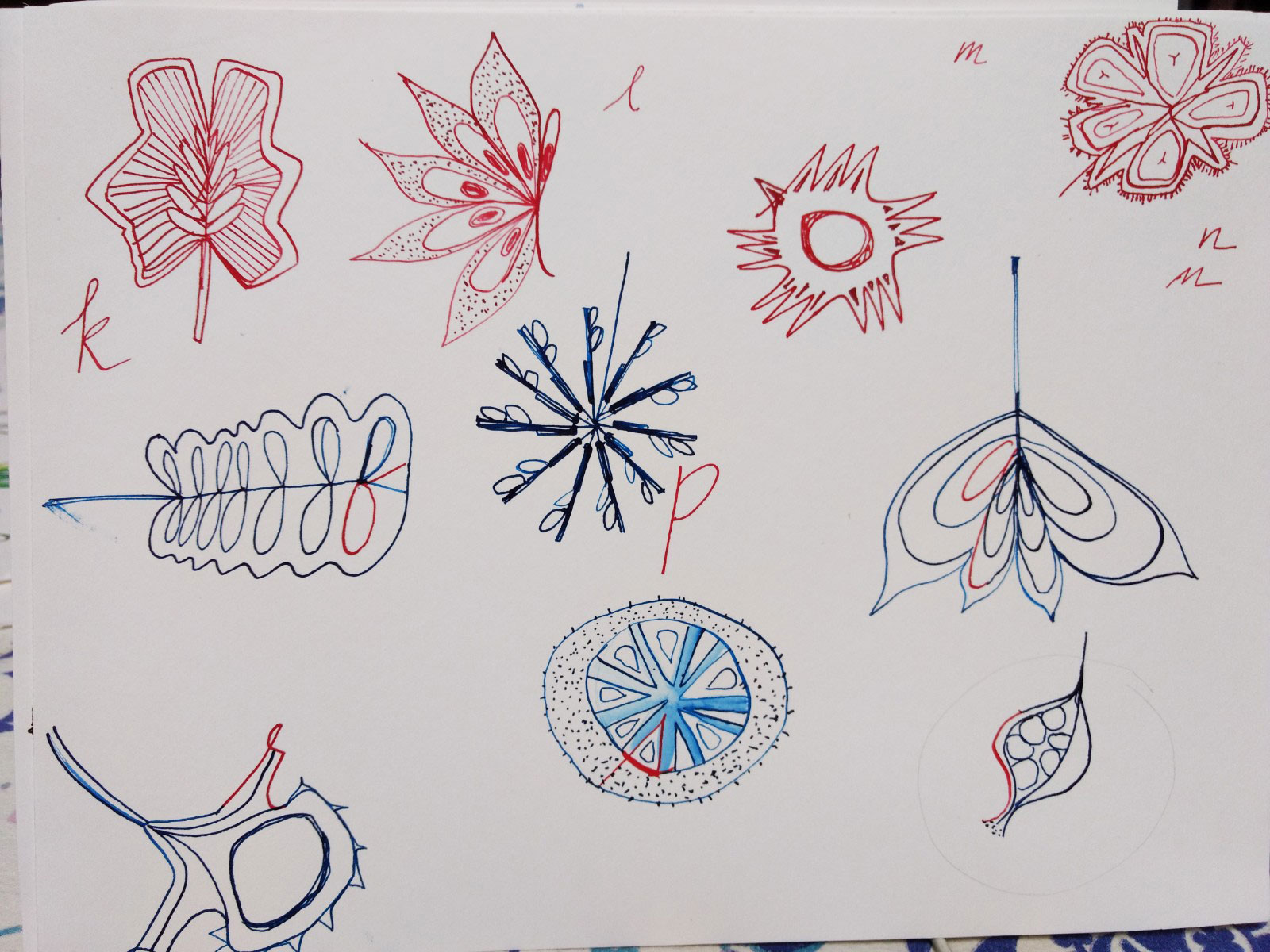
More drawings/paintings of imaginary flowers and seed pods. I really got into these!
This one was the final assignment, a mid-century inspired design. I used watercolor and dip pen. Also used a little masking fluid but it dries up so fast, I didn’t love using it.
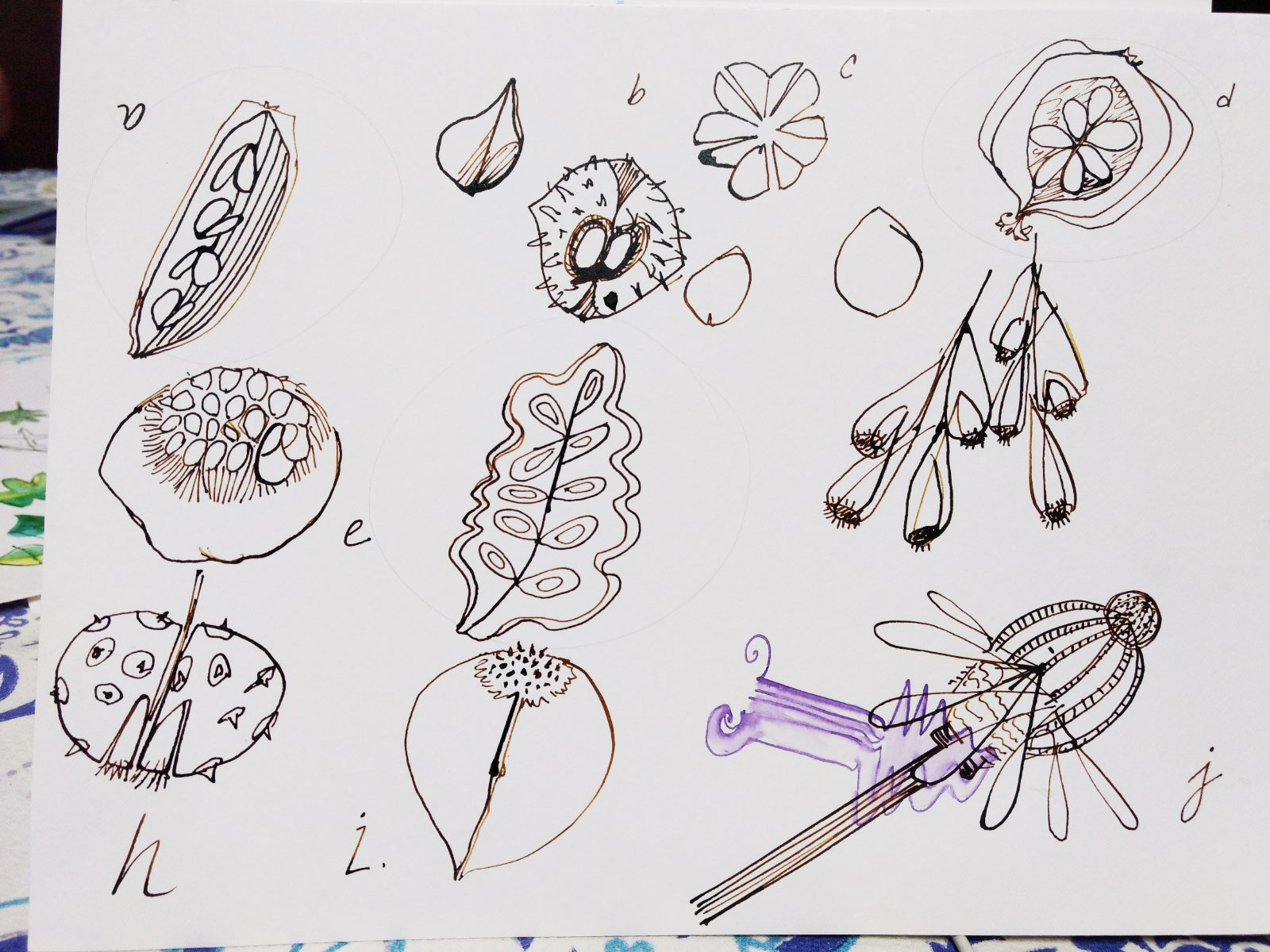
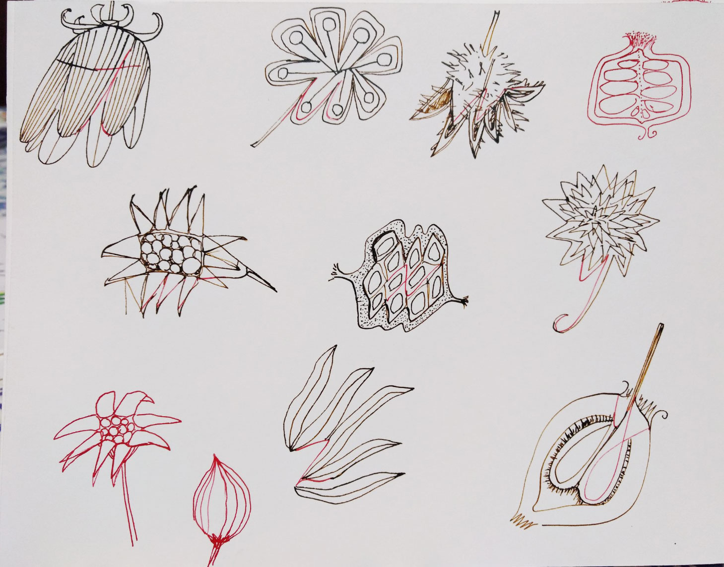
After the flowers A – Z, I created drawings of fantastical seed pods. These were really fun because there are so many weirdo seed pods—I didn’t even need to make them up!